Software: Figma
I. Expert interviews
Interview #1: Matt (beginner)

Matt is a 21-year old college student studying mechanical engineering living in Boston, MA. He first learned about financial planning when he was in middle school, but didn’t devote much time to practicing it until he was in college. His primary financial goal is paying off his student loans. He uses his banking apps to check his account balances and credit score, transfer money to and from accounts, allocate rewards, and track spending categories.
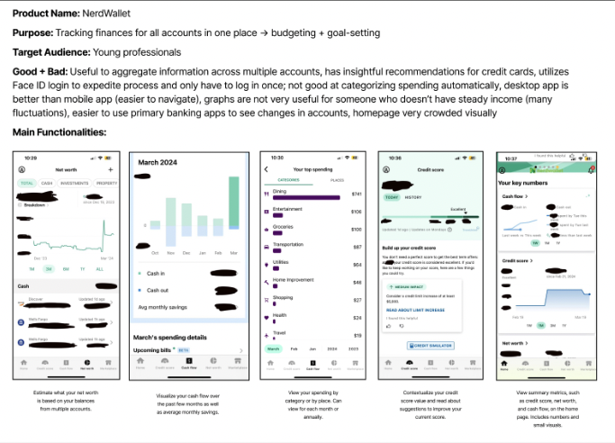
Applications mentioned: Banking apps (American Express, Wells Fargo, Discover), NerdWallet, Venmo, Mint, Excel (for budgeting)
Quote: “Financial planning makes me think of how I can best set myself up for the future, make sure I’m making smart decisions with my money now, and ensure security.”
Interview #2: Femi (beginner)

Femi is a 22 year old 5th year Computer Engineering major. He is an international student. He doesn’t quite remember when he first heard about financial planning but it only really became a tangible concept when he moved to college. He gets most of his information from self guided searches on the web and does some personal reading too. To Femi, the term ‘financial planning’ doesn’t really incite any kinds of feelings. He doesn’t have a savings account but he feels like his investments are his savings because they’re low risk.
Applications mentioned: Acorns, Marcus, BofA, Mint
Quote: “I use a budget in theory, I tend to run over my budget but I haven’t taken the steps to reevaluate my budget and expenditure, to know whether to increase or cut down”
Interview #3: Milind (expert)

Milind is 55, lives in California, and works at a semiconductor tech company. He grew up in India and moved to the US for graduate school. He didn’t hear about financial planning until he was in his late 20s and worked at a startup that had 401ks. He used spreadsheets to budget in the past and his bank’s app to see categories. Now, he gets his financial advice from a financial advisor as he prefers talking to a person over using an app. He does wish more financial planning services were available on mobile devices for quick accessibility.
Applications mentioned: Spreadsheet, Bank of America/Chase App, Splitwise
Quote: “Financial planning in terms of for your future is somewhat of a luxury but it is important for everyone to at least think about their short-term goals.”
Interview #4: Colin (insider)

Colin Hamilton has been the Retirement Benefits Director for The TJX Companies, Inc. since 2013. He is responsible for oversight of a variety of defined contribution and defined benefit programs in the US and abroad. Prior to joining TJX, he spent nearly twenty years working in benefits administration for Putnam Investments and Mercer. He is lifelong saver and encourages others to begin when they are young.
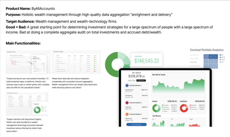
Applications mentioned: Morningstar Wealth - “ByAllAccounts”, Excel
Quote: “People listen to their peers and people listen to their trusted advisors. Someone from another company is neither a peer nor an advisor.”
II. Competitive analysis
Synthesis
Unmet needs
Lack of comprehensive understanding and practice of financial planning
Limited awareness of budgeting techniques and financial goal setting
Information + content
Educational resources on budgeting, saving, and investing tailored to beginner-level users
Guidance on managing student loans and debt repayment strategies
Features
Interactive budgeting tools for easy tracking and adjustment of expenses
Gamification + incentives
Short-term planning
Clear, simple, explanations of vocabulary/concepts
III. Ideation
HMW statement
How might we clearly distinguish need-to-know information from in-depth analyses on financial planning apps?
Project proposal: FrankBank
Persona

Goals & context:
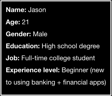
Jason is a current undergraduate student who is funding his own education. He often worries about his expenses as he was never taught how to properly budget his money, making it difficult for Jason to calculate how much he needs to be saving to pay off student loans. He has tried to use his native banking apps to monitor his financial situation, but frequently finds himself overwhelmed by the information he finds. Jason uses his banking apps about three times per week on his phone, but sometimes logs in using his desktop when planning to read articles on a topic or use many of the app’s functionalities at once. His main reasons for using his banking apps are to check his account balance, monitor spending categories, and view his credit score.
Concerns:
Jason has often found that his banking apps operate extremely slowly, often making it difficult for him to receive financial information that is completely up to date. He also worries about his login experience on his banking apps, as all of them only require him to log in once (sometimes via FaceID) before all features are viewable and interactive. Jason worries that he is more susceptible to fraud as a result.
Summary quote:
“Can chatGPT write out my student loan repayment plan for me?”
Brainstorm sketches


Idea #1: The Widgets
With widgets, users can select which information they want displayed on their app home screen and how it appears. This avoids overwhelming users with information they don’t care about, and they have the option to hover over the widget to receive more in-depth information.


Idea #2: The Drawers
With drawers, users can manually “pull” information onto their screen when they need it. Only a few drawers can be open at the same time, so they help control the flow of information on a user’s screen.


Idea #3: The Dots
Similar to other websites that contain too much text for a given space, the ellipses gives users the option to read more about a specific financial topic without being forced to digest the information. These dots would function differently by bringing the information onto the same page instead of navigating elsewhere on the app.
Idea #4: The Carousel
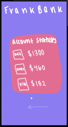
As opposed to presenting all information to a user on the home page at once, each financial metric will be one slide on a carousel that rotates through elements for a given period of time (~10 seconds). If a user is interested in learning more about a particular topic, they can click on the card to be taken to that topic page.


Idea #5: The Swipe
Users are able to quickly filter through their financial information on their home screen by swiping left on topics they are not interested in, and swiping right on topics they want to revisit. This reminds them to re-examine certain topics in depth to make the information more digestible.
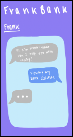

Idea #6: The Chat
Users can ask a digital chatbot to see their desired information directly. This completely eliminates the need to display any information on the homescreen, other than prompts to help the chatbot display the information the user wants to see.
Winning idea


Idea #1: The Widgets
With widgets, users can select which information they want displayed on their app home screen and how it appears. This avoids overwhelming users with information they don’t care about, and they have the option to hover over the widget to receive more in-depth information.
Storyboard

IV. Structure + layout
Workflow/taskflow
Goal: View essential financial information in one place
Task: Use FrankBank to create finance dashboard
Steps:
Friend tells you about FrankBank, download app (entice/trigger)
Sign up for an account/login (enter)
Take needs survey
Pair bank accounts
Set goals for identified needs (engage)
Land on Dashboard
Customize Dashboard widgets as needed
Click on widget to learn more about account information or topic
Close app [time passes]
Receive notification on lockscreen that you made progress towards your goal
Open app to view changes in Goals tab [close app, time passes]
Once goal is achieved, receive congratulations message; include option of sharing with social network (exit)
Prompt to add new goals through second needs survey on Goals tab (extend)
Paper prototypes
V. Look + feel
Concept
Concept name
Fluidity
Concept description
I am cohesive and natural. I am casual, approachable, and intuitive. I can transition with ease and solve your problems. I am loose, yet organized.
Moodboard

Explorations

Color
I chose these colors to follow the futuristic, modern, and almost liquid feel of the app shown on my moodboards and explorations. The color scheme rests heavily on a dark purple, adding in a light green/yellow and orange color as accents to create an outer space/asteroid aesthetic. The alert colors follow typical conventions.

Type
I’ve decided to use a type called TT Travels Next, which is a font family that contains many variations. The idea for the TT Travels Next typeface was to create a very trendy and modern wide display sans serif for use in different sets, be they print or web. I picked this font because I believe it looks futuristic, fluid, and simple, which aligns with the overall aesthetic I am trying to achieve with my app. I chose to pair TT Travels Next with Raleway for content and captions so the text took up less space and was more functional, while still looking futuristic and clean.

VI. Iteration v1
Changes made from paper prototypes
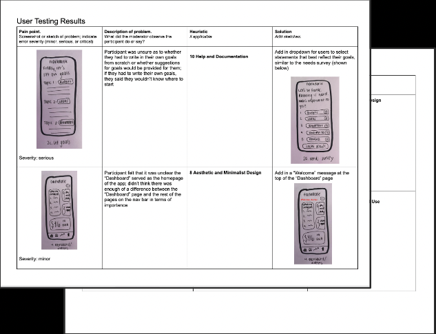
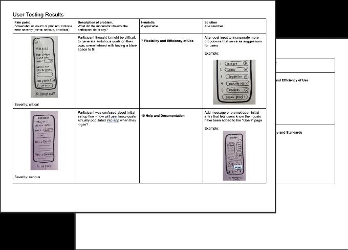
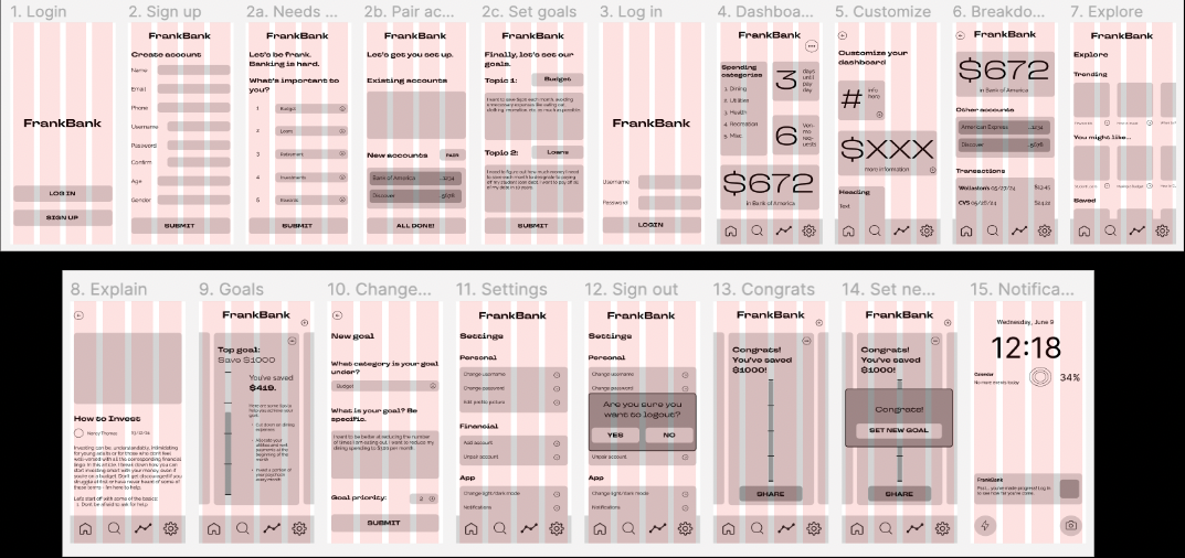
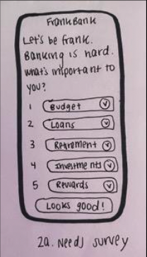
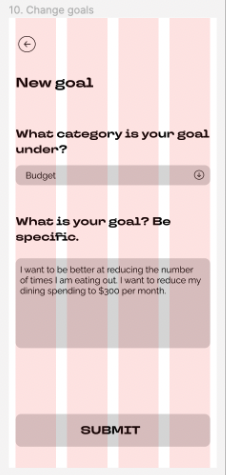
Added in dropdown for users to select statements that best reflect their goals, similar to the needs survey
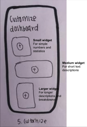
Added labels to widgets and gave a brief description of the widget type on “Customize” page
Made action buttons on page before clearer so user knows pages are separate/they have moved onto the next page (ex: “Looks good!”, move to next page)
1
2

3
Changes made from lo-fi wireframes
Changed format of “Goals” page to allow users to select verbs and descriptors from a drop-down menu to create their goals, similar to the creation of a new goal on the “Goals” page
Created open-ended text box on needs survey page for users to write topics that are most important to them for their own reference only
Eliminated goal priority question in process to create a new goal
1

2

3
Changes made from hi-fi wireframes
Created icon system for widgets that could be used to classify information source and type
Changed color scheme to remove bright orange; shifted instead to red, yellow, and blue accent colors and black/white widgets
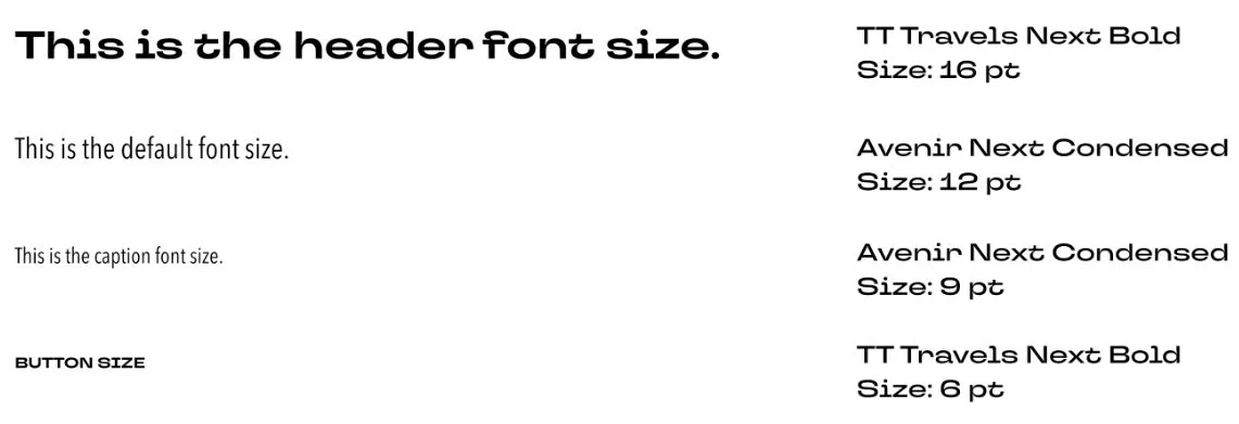
Changed typeface from Raleway to a more condensed typeface, Avenir Next Condensed, to save space and increase readability
Removed “Goals” and “Explore” sections to simplify app scope

1

2

3

4
Updated workflow/taskflow
Goal: View essential financial information in one place
Task: Use FrankBank to create finance dashboard
Steps:
Open app
Create account and pair finances
Navigate to Dashboard
Click three dots to customize and add a widget
Click on a widget to view information breakdown
If needed, go to external financial app for more details
Navigate to Widgets page
Add FrankBank widget(s) to iPhone home screen
Keep track of financial progress daily and update dashboard as needed!

Updated color + type

VII. Iteration v2
Hi-fi updates
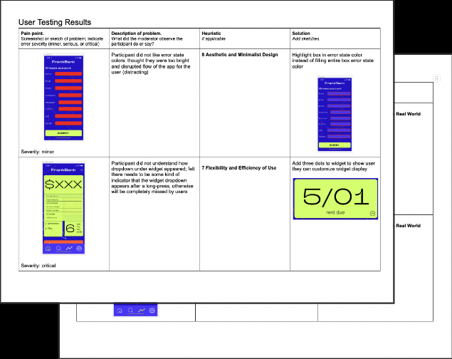
After gaining valuable peer/instructor feedback, I decided to continue working on my hi-fis to modify the widget and icon systems on the dashboard.
Namely, I brought more color back to the app by making the widgets on the Dashboard page different colors (red, green, or blue), which still match to the source of the financial information (red for bank, green for credit card, and blue for Venmo). However, as mentioned in class, color alone is not accessible for those who are color blind or who have visibility issues. Therefore, I decided to also reflect the source of financial information using number. In this system, one shape represents bank information, two shapes represents credit card information, and three shapes represents Venmo information. Now, the number (along with color) can be used to identify information sources. All shape icons are now black, but the shape identifies information type (circle for time-based, square for quantitative, and triangle for qualitative).
These changes (replacing color identifiers with number identifiers and adding color to widget shapes) make the FrankBank widgets more user-friendly, accessible, and aesthetic. The iPhone home screen widgets reflect the same changes. All other functionalities have remained unchanged.
Reflection
This project has underscored for me the vital role of critique and iteration in the design process. Feedback from user testing and presentations has been instrumental in refining my initial ideas and enhancing the overall design of my feature. These stages were pivotal in driving significant improvements, making them the cornerstone of my design journey.
Embracing flexibility in the design process is paramount to its success. Through my experiences, I've learned the value of remaining open to pivoting ideas and adjusting scope as needed. Sometimes, the initial vision might not align with practical realities or user needs. By being receptive to change, I've been able to steer projects towards more effective solutions. This adaptability not only fosters innovation but also ensures that the final product resonates more deeply with its intended audience.


